Visual options
Using visual options, you can customize the colors and styles used in most graphs.
|
To access visual options |
|
|
In view mode: Click |
|
|
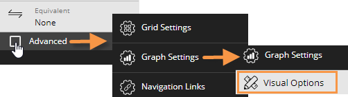
In explore mode: Checkmark Advanced at the bottom of the toolkit. Expand Graph Settings. Click on Visual Options.
|
 |
Choose a color palette
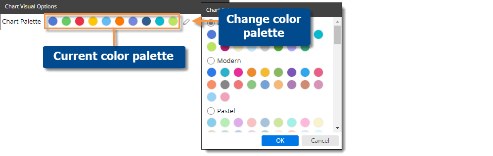
At the top of visual options, click  to change the color palette, which controls the default colors of most graph components. Salient Dashboards will apply the selected palette's colors in the order they are shown (e.g., blue to first component, green to second component, etc.). The available palettes depend on the dataset configuration.
Tip: You can override the selected palette by choosing a color for an individual graph component as explained below.
Customize graph components
Depending on the graph type, you can customize individual graph components (e.g., bars, lines, points, etc.). In visual options, click in the row of the component to make the following changes:
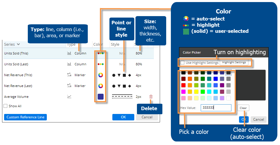
Tip: If you don't see the measure/format, checkmark the Show All box.