Axis management
You can customize the axes of several graph types, including Trend, Comparative, and Multi Comparative.
|
To customize axes |
|
|
Before proceeding, add the desired measures.
|
|
|
Actual value: 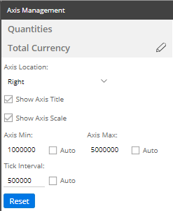
Percent change: 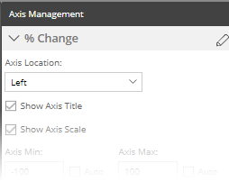
|
 in the upper-right corner of the widget, and select Axis Management.
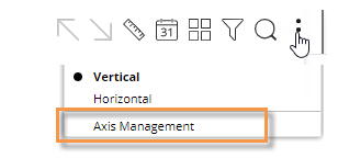
 .
.