Highlight data
You can highlight data based on custom criteria or percent of the total (i.e., heatmap) to spot areas of concern or importance. The availability of highlighting depends on the widget type.
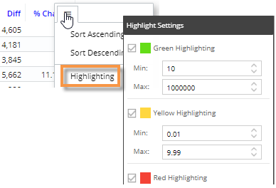
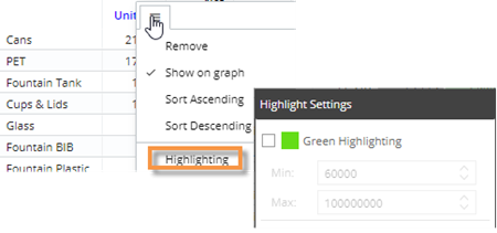
Grid highlighting based on custom criteria
You can highlight grid data based on custom thresholds (e.g., percent change below or above a given value). Data that meet the criteria will show the selected symbol (e.g., circles) or the entire cell may be highlighted.
|
To highlight data based on custom criteria in a grid (in explore mode) |
|
|
|
|
|
 .
.
Tips for grid highlighting:
• Grid highlighting cannot be configured in view mode using the previous method; instead, users can turn on highlighting in graph format (see below) and then switch back to the grid. This will apply highlighting to the applicable columns.
• To access highlight settings for Gauge widgets, click  in the upper-right corner of the widget and select Highlight Settings.
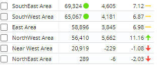
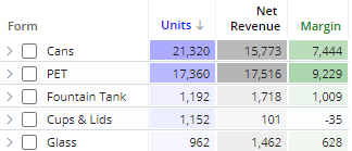
Heatmap highlighting in grids
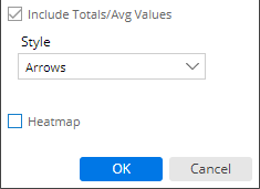
You can highlight grid cells based on the percent of the total for a given column to create a "heatmap"; the darkest shades represent the largest values. This method does not require you to enter criteria because the shades are calculated automatically.
|
To turn on heatmap highlighting (in explore mode) |
|
|
|
|
|

Tips for heatmap highlighting:
• You can use heatmap highlighting in conjunction with custom highlighting ranges (see the previous section). In this case, any "cell" highlighting styles will switch to circles to avoid conflicts.
• Heatmap highlighting does not shade negative data.
• Heatmap highlighting is available in several types of grids (Comparative, Trend, etc.). For all widget types, shades are calculated based on the total for the given column as opposed to the total of all columns.
• Some measures, such as average price, do not have meaningful totals and, therefore, show "average" values in the totals row. For these measures, the heatmap shading will be 100% of the color whenever the value meets or exceeds the average for that column. If this results in shading that is too dark, you may want to select a lighter custom color as explained in step 6 above.
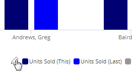
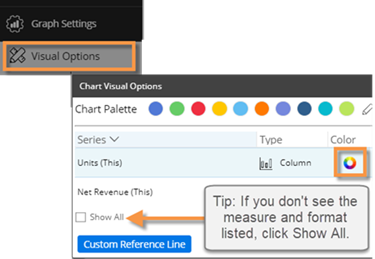
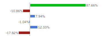
Graph highlighting
Graph components (bars or points) can be highlighted when data meets custom criteria.
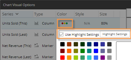
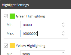
|
To highlight data in graphs |
|
Tip: You can also access visual options under Graph Settings in the toolkit (in explore mode). |
|
|
|
|
|
 in the graph legend (available on mouseover if the legend is enabled).