Graph settings
Graph settings allow you to customize the appearance of the graph format of a widget.
In explore mode, click on  at the bottom of the toolkit to access graph settings.
|
Setting |
Explanation |
|
Visual Options |
Click on Visual Options to access options for graph colors, column thickness, marker size, marker type, etc. The available options depend on the graph type. |
|
Show Graph Toolbar |
Optionally, clear this option to remove the paging toolbar from the bottom of a widget with multiple pages of data. Clearing this option may be useful when creating simplified widgets. |
|
Enable Data Labels |
Check this box to show data labels beside the graph components (e.g., lines, bars, bubbles, etc.) to indicate their values. For optimal display, the widget should be large enough to accommodate the selected labels. Only the bubble format of the scattergram will show data labels. |
|
Enable Name Labels (only affects mix and scattergram graphs)
|
Check this box to show labels that indicate the member names. This can be used on its own or with the "Enable Data Labels" setting. |
|
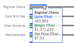
Enable Shared Tooltips |
Check this box to show values for multiple measures or items in the same tooltip, or clear this box if you want tooltips to show data for a single measure or item at a time. This option is required if column grouping is turned off. When shared tooltips are enabled:
For example:
|
|
Hide Legend |
Check this box to hide the legend. Note that this will also turn off visual options in view mode, since this area is accessed by clicking on |
|
Enable Column Grouping (only affects Comparative, Comparative Time Series, and Trend bar graphs) |
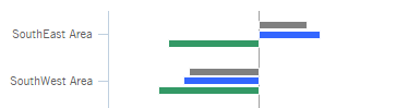
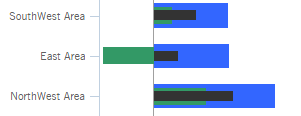
Check this box to show measures beside or underneath each other (rather than overlapping). This option shows a cluster of bars for each item in the graph and ensures that bars do not cover each other up. For example: Clear this box to create an overlapped bar graph. This option may be preferable in some situations such as when you want to compare related measures or include several items on the graph (i.e. saves screen space). For example: Tip: Measures are drawn based on the order in the corresponding numbers view with the first measure on top; therefore, when column grouping is off, you may want to adjust the order in the corresponding grid. In addition, you may want to adjust the bar width (see below) in an overlapped bar graph.
|
|
Hide X Axis |
Check this box to hide the X axis label. |
|
Hide Y Axis |
Check this box to hide the Y axis label. |
|
Scale Min and Scale Max (Gauge only) |
Define the minimum and maximum values of the scale. We recommend specifying appropriate minimum and maximum values when graphing actual values in a Gauge. |
|
Truncate Expanded Rows (only in Mix, Comparative, and Multi Comparative graphs with auto-expanded dimensions and a standard grid type) |
Enter the maximum number of subgroupings to show for each auto-expanded dimension member (e.g., up to five brands for each region).
|
|
Graph Page Size (only in graphs that compare members) |
Enter the maximum number of members to show on one "page" of the graph. If the context has more members than the page size, users will be able to browse to additional pages in a Comparative/Multi Comparative graph. You cannot increase the page size beyond the maximum limit set by your administrator. Note that the member count includes all levels if dimensions are auto-expanded. For example, five regions expanded into ten zip codes each would result in a count of 5 regions plus 5 x 10 zip codes = 55 members. This would exceed a graph page size of 50 and, therefore, extend to an additional page of data. A trellis graph does not provide paging. Instead, a trellis graph shows the number of 1st By members defined by the layout (e.g. 2 x 2) and returns 2nd By members up to the graph page size for each small graph. |
|
Show Graph Total (Comparative and Exception only) |
Check the box to include a Totals bar that aggregates results for the members in the context or clear this box to remove the Totals bar. You may want to turn the totals bar off in actual value graphs to make the scale more appropriate for individual members. |
|
Graph Orientation |
Select horizontal or vertical orientation. |
|
Dynamic Axis Scaling (Trend and Share Trend only) |
Check the box to start the axis at the minimum value and extend to the maximum value. With this option off, the axis always starts at zero. Dynamic scaling makes it easier to see small fluctuations in the data. |
|
Auto Zoom (Geo only) |
Check the box to automatically zoom to maximum extent of data or clear this option to stay focused on the same area when you make changes. |
|
Base Layer (Geo only) |
Select the spatial layer set to display in the background of the map. These layers must be pre-configured by your administrator. |
|
Graph Positive and Negative Data (Crosstab only; only affects Mondrian and DeltaMap) |
To show negative data, check Graph Positive and Negative Data (on by default). In this case, any negative data will be outlined in red in the graph. To hide negative data, clear Graph Positive and Negative data. |
|
Show This, Last, Difference, or Percent Change (Gauge only) |
These options show or hide metrics underneath the main number in a numeric gauge. You may want to hide numbers to simplify the Gauge.The available options depend on the selected type (Percent Change, Actual Value, or Difference). |
 in the legend.