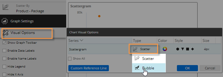
Bubble chart
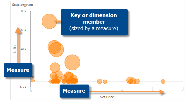
The bubble chart is a scattergram that sizes its points based on a variable to show the relative importance of the items that they represent in addition to trends and outliers.
|
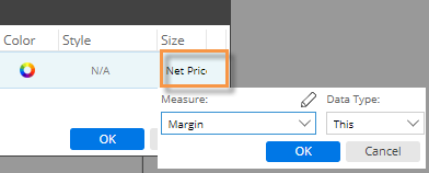
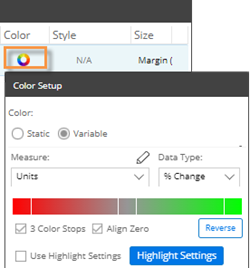
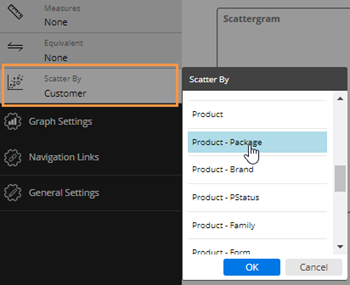
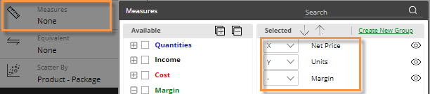
To configure a bubble chart |
|
|
|
|
|
|
|
|
|
|
|
|
|
The bubble chart is a scattergram that sizes its points based on a variable to show the relative importance of the items that they represent in addition to trends and outliers.
|
To configure a bubble chart |
|
|
|
|
|
|
|
|
|
|
|
|
|
 to add it.