Types of Data Analysis Widgets
A dashboard can include any of the following data analysis widgets. In explore mode, you can change the analysis type. In any mode, you can switch between grid and graph formats (if enabled for the widget).
|
Analysis type |
Examples |
|
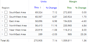
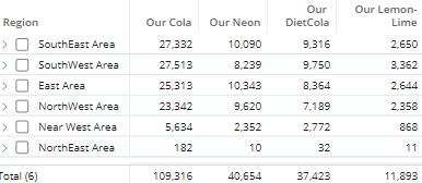
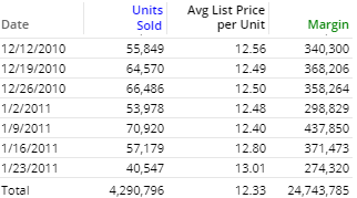
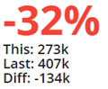
Comparison of members for one or two date ranges; any number measures. |
|
|
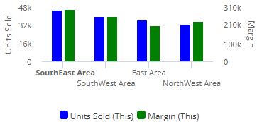
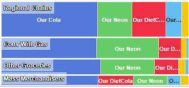
Comparison grid or graph that organizes data by two different attributes (i.e., dimensions) to examine cross-sections of data. |
|
|
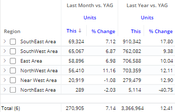
Comparison of members for any number of date ranges and measures; column filters may be applied to focus on specific subsets of data and provide dynamic benchmark comparisons. |
|
|
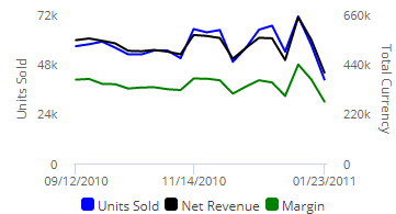
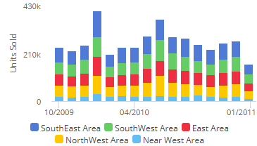
Trend over time for one or two date ranges for multiple measures |
|
|
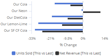
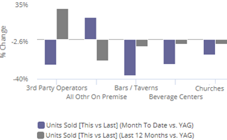
Comparison trend for multiple members; either actual values or percent of the total for single measure |
|
|
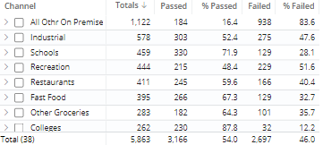
Pass and fail of key members for an exception test (e.g., customers with units >=1) |
|
|
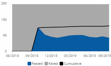
Pass and fail of key members for an exception test over time |
|
|
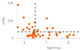
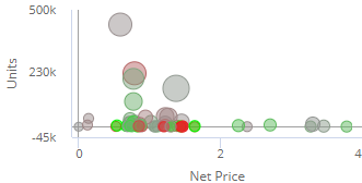
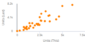
Plot of members along two axes to show trends and outliers. The points can represent key members (e.g., customers) or dimension members (e.g., regions). Additional variables can be used to color and size the points (i.e., "bubble chart"). |
|
|
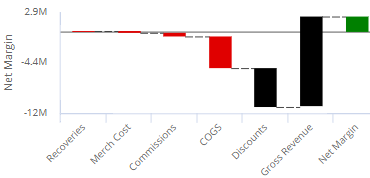
How the components of a calculated measure affect its make-up |
|
|
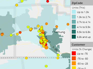
Map showing data values and/or change since another date range |
|
|
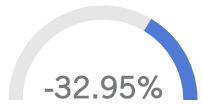
A simple visual tool showing performance; single measure |
|
|
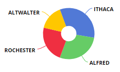
Percent of the total for multiple members for one or two date ranges; any number of measures |
|


|
Tips: |
|
|
|