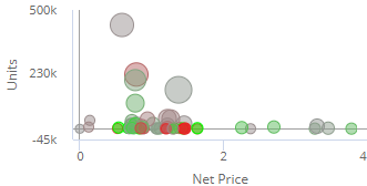
Scattergram graph
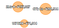
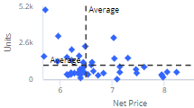
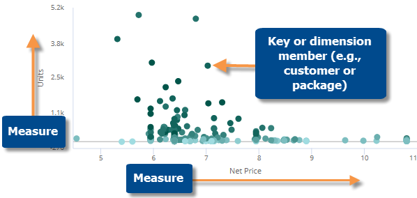
This graph plots key or dimension members (e.g., customers or regions) as points, allowing you to see where they fall in the relationship of any two variables. Points are usually clustered along a line or curve. The points that fall far away from the line or cluster may need your attention. Typically, the x and y variables represent values for two measures for the main date range (This), but the graph can alternatively plot values for two date ranges for the same measure (i.e., cross-date scattergram). In either type of scattergram, additional variables may be used to color and/or size the points. A graph that sizes the points based on a variable is called a "bubble" chart
|
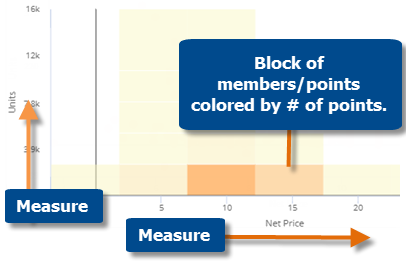
By default, the Scattergram shows each member as a point; however, for performance reasons, the Scattergram groups the data into blocks if it contains many members. The default threshold for the block Scattergram is 25,000 members, but can be changed by your administrator. |
|
|
Scattergram graph options |
Explanation |
|
Zoom |
In zoom mode, you can zoom in on any area of the scattergram (e.g., on a cluster of points). Click
Click Reset to go back to the original scattergram. Zoom mode is not available in a block scattergram. |
|
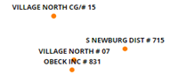
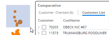
Select and list (i.e., rubber-banding) |
In select mode, you can select and list any members to learn more about them. Click
For the rubber-banding capability to be available in view mode, the "allow spawning" option must be on in dashboard settings. |
|
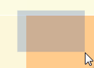
Filter (block mode only) |
In filter mode (available in block mode only), you can select an area of the Scattergram to focus on. All other data will be temporarily filtered out. Click
To return to the original Scattergram, click |
|
In graph settings (in explore mode): |
|
|
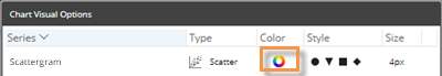
Optionally, choose how to color the points or bubbles. Click on Visual Options under Graph Settings. Then, click in the color column.
Choose from the following: Static - same color for all points or bubbles. Click the Variable - color gradient or highlighting ranges for a variable: For a color gradient - In the color setup area, select the measure and type (timeframe or calculation) of the variable. If you don't see the measure listed, click
For highlighting - In the color setup area, check the Highlight Settings box and then click the Highlight Settings button to set up custom ranges. |
|
|
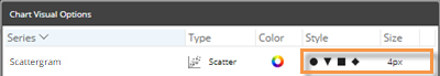
- Point size and symbol (for regular scattergram) |
Optionally, customize the point size and symbol in regular scattergrams, which use the same size for all points. Click on Visual Options under Graph Settings. Then, click in the style and/or size columns to customize the points.
|
|
- Bubble |
To size points based on a measure, select bubble type and choose additional formatting options.
|
|
- Labels |
Check the Enable Name Labels box to turn on labels showing what each point/bubble represents.
(Bubble only) Check the Enable Data Labels box to show the data used to size the bubbles.
|
|
- Quadrant lines |
Optionally, add custom reference lines to create quadrants.
|
|
In general settings (in explore mode): |
|
|
Include Nulls |
By default, the Scattergram shows only the members that have data for the selected date range; in other words, it removes null members. You can include the members without data by turning on Include Nulls in general settings. |
 in the upper-right corner to turn on Zoom mode. Then, click and drag to zoom.
 icon to change the color.