Scattergram widget
|
Scattergram Overview |
|
|
Description |
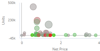
Plot of members along two axes to show trends and outliers. The points can represent key members (e.g., customers) or dimension members (e.g., regions). Additional variables can be used to color and size the points (i.e., "bubble chart"). |
|
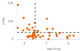
Examples: Scatter format |
|
|
Bubble format |
|
|
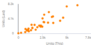
Cross-date scattergram |
|
|
Date setup |
This widget shows results for one or two date ranges. Click on |
|
Filter By |
This widget aggregates data rather than comparing separate groupings. Filters may be applied. |
|
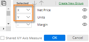
Measure setup |
To select measures, click
|
|
Scatter By |
The Scatter By controls what is plotted on the Scattergram. The Scatter By can be a key (e.g., customer) or a dimension (e.g., region). A point or bubble will represent each member. Click on Scatter By in the toolkit (in explore mode) to change the key or dimension. |
|
Formats |
|
 in the widget toolbar (visible on mouseover) and select from pre-configured or custom options for "This"
  in the widget toolbar (visible on mouseover) and click Edit Measures, or