Configure size and color in Crosstab graphs
The size of blocks, bars, or bar segments in Crosstab graphs (DeltaMap, Mondrian, or Stacked/Unstacked Bar) represent a measure. The colors in these graphs can represent attributes (i.e., members) or a measure. You can configure these settings in Visual Options, which you can access by placing your cursor over the graph legend and clicking  .
.
To configure size in Crosstab graphs
-
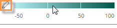
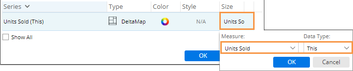
In Visual Options, click under the size column.
-
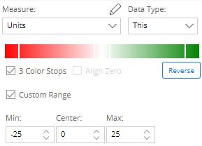
Under Measure, select the measure to use for sizing the blocks, bars, or bar segments in the graph. This menu includes measures that have already been added to the widget. In explore mode, you can click
to select a different measure. -
Under Data Type, select the specific format (values for This, values for Last, Diff, % Change, etc.) to use for determining size.
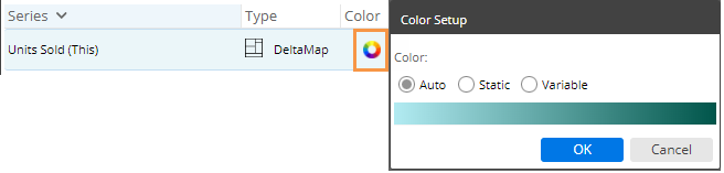
To configure color in Crosstab graphs
In Visual Options, click under the color column. Then select from the following options.
|
Color option |
Explanation |
|
Auto |
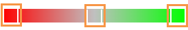
This option shows percent change between This and Last for the currently selected measure using a teal color gradient. The darkest blocks have the highest percent change.
|
|
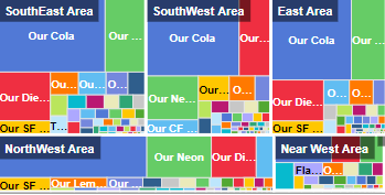
Static |
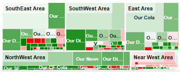
This option uses a color to represent each attribute (i.e. member). You can color members of the 1st By or Cross By. If you select the Cross By, it's easy to see who or what had the highest values across the 1st By (e.g., Our Cola in each region). The static option will use member colors if they have been defined in dashboard settings; otherwise, the colors will be based on the color palette in visual options.
|
|
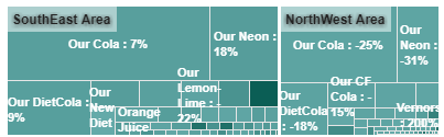
Variable |
This option lets you select a measure, format (value, % change, difference, etc.), and color gradient.
For example:
|