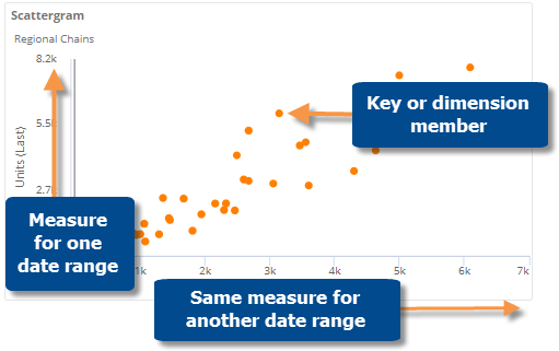
Cross-date scattergram
A scattergram can compare two timeframes for the same measure―one date range on the x axis and another date range on the y axis. If values are about the same between timeframes, points will be clustered along a line with a slope of approximately one. This type of scatter plot can answer questions like: Did customers buy more this period or last? Who or what did not fit this pattern?
|
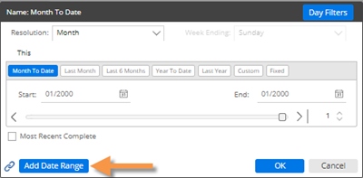
To configure a cross-date scatter plot |
|
|
|
|
|
|
|
|
|
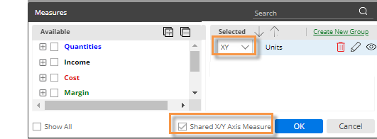
 icon, and choose from the Data Type-X or Data Type-Y menu.
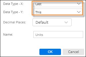
-
(Optional) To color the points based on a variable, go to Visual Options (under Graph Settings in the toolkit) and choose from the same options available in the regular scattergram.