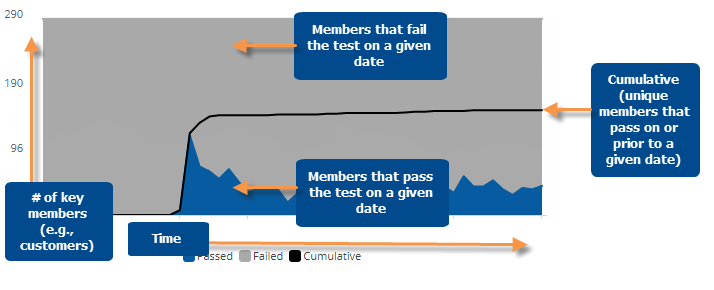
Exception Time Series graph
This graph shows the number of passing/failing key members (e.g., customers) for each date in the date range as well as the cumulative members that pass at least once over time. If the graph compares two date ranges, an additional line shows the number of passing key members during Last date range.
|
Exception Time Series graph options |
Explanation |
|
Visual options (colors) |
To access visual options in view mode, click In visual options, choose colors to represent passing members, failing members, and cumulative members.
|
|
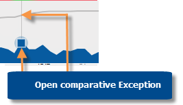
Open Exception for date |
You can click on a date (on passing or cumulative line) to open a comparative Exception widget for that date.
For this option to be available in view mode, the "allow spawning" option must be on in dashboard settings. |
|
Select dates (i.e. rubber-band) |
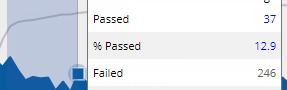
In Select mode, you can view passing, failing, and cumulative numbers for a subset of the date range (e.g., just a few weeks) in a pop-up window. Click
Consider the following when selecting dates:
|
|
Zoom |
In Zoom mode, you can zoom in on a subset of the date range (e.g., just a few weeks). Click
To zoom back out, click Reset zoom. |
|
In graph settings (in explore mode): Data labels |
 in the
graph legend (visible on mouseover). Visual options are also available
under graph settings in explore mode.
in the
graph legend (visible on mouseover). Visual options are also available
under graph settings in explore mode. 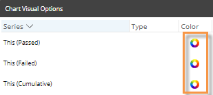
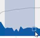
 in the upper-right corner to turn on Select mode. Then, click and drag around the dates you want to see.