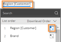
Auto-expansion in graphs
In some graphs, dimensions and keys can be expanded to see granular results. In Comparative and Multi Comparative graphs (see below), you can expand data to visualize performance of subgroupings. Mix graphs can show pie slices for subgroupings—in either a "sunburst" format or as independent pie slices. You can also expand data in a Trellis.
Expand data in Comparative/Multi Comparative graphs
|
|
|
|
|
 when auto-expand is on.
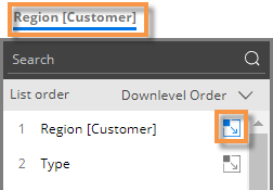
The data layout depends on the underlying grid type, which can be changed in explore mode:
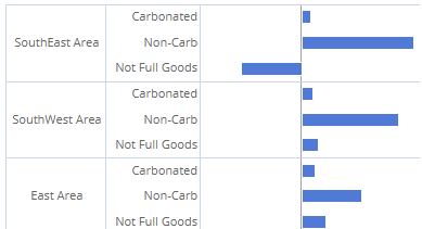
Comparative/multi comparative graph with "standard" grid type
This graph shows subgroupings within the parent-level.
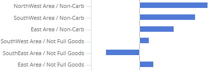
Comparative/multi comparative graph with "flat view" grid type
This graph has separate bars at the same level for each unique combination. Bars can be sorted independently of the parent level.
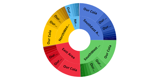
Expand data in Mix graphs
|
|
|
|
|
The data layout depends on the underlying grid type, which can be changed in explore mode:
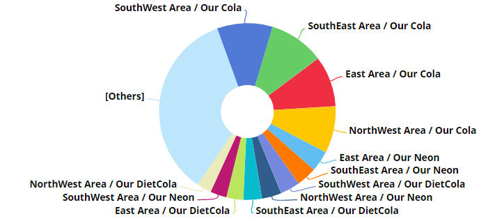
Mix graph with "standard" grid type (Sunburst)
This graph shows the hierarchy and magnitude of data in a "sunburst" chart. The center ring represents the top-level data (1st By); the data becomes more granular as you move outward. For example, the next ring represents the 2nd By. The slices are sized based on data values and aligned with their parent level to show how much each piece contributed (e.g., brands within each region) .
|
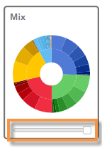
Tip: For a sunburst, we recommend setting the Graph Page Size to a large number; otherwise, the pie may only show a subset of the data. To set the graph page size, use the slider at the bottom of the graph (i.e., drag the slider all the way to the right). |
|
Mix graph with "flat view" grid type
This graph has separate pie slices for each combination of members. The pie slices are at the same level to show each unique combination's contribution to the total.