Gauge graph
The Gauge shows a value, percent change, or difference in a simple format for a quick glance at key performance indicators.
|
Formats |
|
 |
|
|
Circle (solid gauge on) |
|
 |
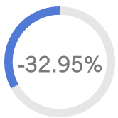
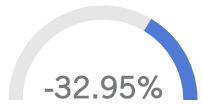
Tip: The shaded area starts at the top and goes clockwise for a positive number, or counter-clockwise for a negative number.
|
|
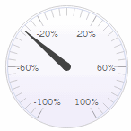
Semi-Circle (solid gauge on) |
|
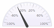 |
Tip: For negative numbers, the shaded area starts at the right and goes to the left; for positive numbers, the shaded area starts at the left and goes to the right. |
 |
|
Gauge graph options |
Explanation |
|
Actual Value, Percent Change, or Difference (only in comparisons of two date ranges) |
Click For a budget measure, Percent Change and Difference options show variance between the budget value and This date range. We recommend setting appropriate minimum and maximum values in general settings when graphing actual values. |
|
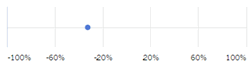
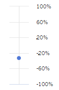
Horizontal, Vertical, Circle, Semi-Circle, or Numeric |
Click |
|
Solid gauge |
Click |
|
Truncate Label |
Click |
|
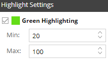
Highlight Settings |
Click
The regular gauge (i.e., not solid) highlights the specified ranges on the scale. The solid gauge highlights the entire circle or semi-circle if the value (or percent change) falls within the highlight range. The numeric gauge applies highlight settings to the primary number (i.e., percent change or actual value) if it falls within the range.
Tip: If the widget does not show the selected highlight settings, make sure that Use Highlight Settings is turned on in the color area of Visual Options. |
|
In graph settings (in explore mode): |
|
|
- Show labels |
You can turn on/off labels using the Enable Data Labels option under graph settings. |
|
- Scale minimum and maximum |
By default, the graph goes from -100 to 100 (or zero to 100/-100 for a solid gauge). However, you can adjust the scale in graph settings. This may be necessary when you are graphing an actual value and/or want to compare results to a specific range. |
|
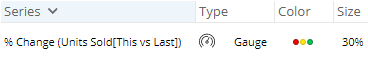
- Color and thickness (solid gauge only) |
You can configure the color and thickness (i.e., size) of solid gauges under graph settings, visual options.
|
|
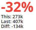
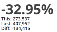
- Show or hide This, Last, Difference, or Percent Change (numeric only) |
You can select from these options in graph settings to show or hide metrics underneath the main number. The available options depend on the selected type (Percent Change, Actual Value, or Difference). |
 in the upper-right corner to choose what to show in the Gauge: Actual Value (i.e., This value); Percent Change between timeframes; or Difference between timeframes. By default, the numeric gauge will show what you have selected in large font followed by the remaining metrics in smaller font. If you wish, you can hide the underlying metrics in graph settings (see below).