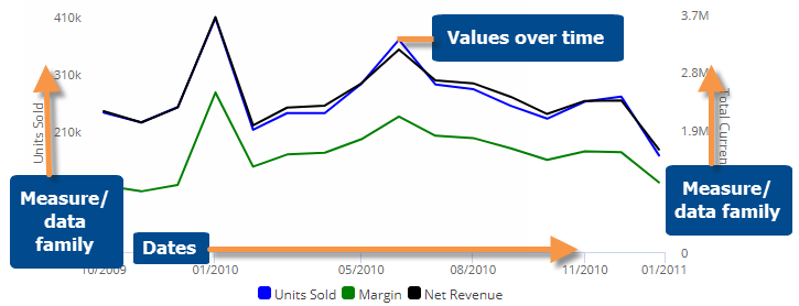
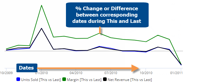
Trend graph
The Trend graph shows changes in performance by graphing measures over one or two date ranges. When two date ranges are selected, the graph can either show actual values or percent change.
Actual value graph
Percent change or difference graph
These graphs are only available when comparing two date ranges.
|
Trend graph options |
Explanation |
|
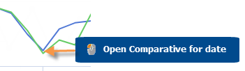
Open Comparative for date |
You can click on a date to open a Comparative widget for that date.
For this option to be available in view mode, the "allow spawning" option must be on in dashboard settings. |
|
Select dates (i.e. rubber-band) |
In Select mode, you can view data totals and averages for a subset of the date range (e.g., just a few weeks) in a pop-up window. Click
Consider the following when selecting dates:
|
|
Zoom |
In Zoom mode, you can zoom in on a subset of the date range (e.g., just a few weeks). Click |
|
Percent Change, Actual Value or Difference |
Click |
|
This and Last, This only, or Last only (only for actual value graphs that compare two date ranges) |
Click |
|
Axis management |
Click |
|
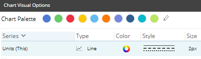
Visual options (colors, line/area/column/marker, size, etc.) |
To access visual options in view mode, click In visual options, choose a color palette and configure each measure by selecting its graph type, style, etc.
|
|
In graph settings (in explore mode): |
|
|
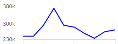
- Dynamic scaling |
By default, the vertical axes start at zero and extend beyond the maximum values; however, in graph settings, you can turn on Dynamic Scaling to start at the minimum value and go to the maximum value. This makes it easier to see fluctuations in the data. For example:
|
|
- Data labels |
In graph settings, check or clear the Enable Data Labels option. |
 in the upper-right corner to turn on Select mode. Then, click and drag around the dates you want to see.
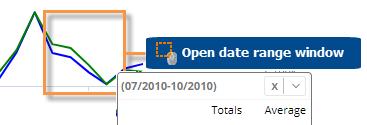
 in the
graph legend (visible on mouseover). Visual options are also available
under graph settings in explore mode.
in the
graph legend (visible on mouseover). Visual options are also available
under graph settings in explore mode.