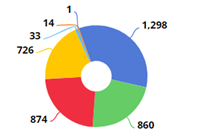
Mix graph
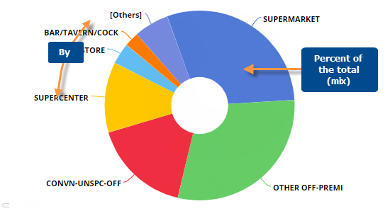
The Mix widget shows the percent of the total or "mix" for each member.
|
Mix graph options |
Explanation |
|
# of members shown (i.e., pie slices) |
To show more or fewer members in the graph at one time, click and drag
the slide control |
|
Show/hide members |
Click on the member in the legend to toggle it on/off in the graph. |
|
Show/hide "Others" |
The graph groups all members not shown into its own category (Others).
You can show or hide the Others by clicking |
|
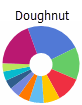
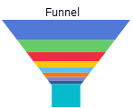
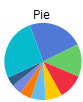
Doughnut, Funnel, or Pie |
Click
|
|
Mix or Difference |
Click
|
|
This or Last data (only in comparisons of two date ranges) |
Click |
|
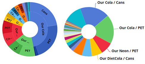
Top-level or expanded data |
By default, the slices in a mix graph represent top-level data (i.e., members of the 1st By); however, you can expand dimensions into additional levels (e.g., combinations of 1st By and 2nd By). Depending on the underlying grid type, the graph may have separate rings for dimension levels in a "sunburst" or show combinations at the same level in a single ring.
|
|
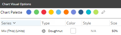
- colors, graph type, etc. |
To access visual options in view mode, click
 in the
graph legend (visible on mouseover). Visual options are also available
under graph settings in explore mode. in the
graph legend (visible on mouseover). Visual options are also available
under graph settings in explore mode. In visual options, choose a color palette and configure the graph type. For doughnut, you can also choose the size of the hole.
Tip: To assign consistent colors to members across the dashboard, go to member coloring in dashboard settings. |
|
In graph settings (in explore mode): Labels and/or legend |
In graph settings, you can enable data labels showing percent amounts and/or name labels showing member names. You can also show or hide the legend. |
 in the bottom-left corner of the
widget.
in the bottom-left corner of the
widget.  in the
upper-right corner (visible on mouseover) and selecting
in the
upper-right corner (visible on mouseover) and selecting