Comparative graph
This graph compares actual values or variance across members. This graph shows any number of measures.
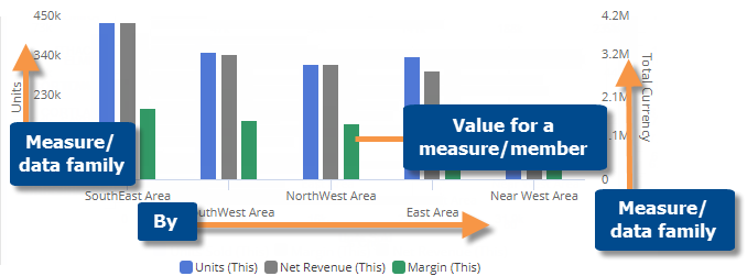
Actual value comparative graph
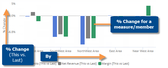
Percent change comparative graph
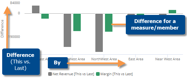
Difference comparative graph
|
Comparative graph options |
Explanation |
|
Compare checked or all members |
If you have checked members, you can display only the checked
members or compare all members (i.e., based on sort). Click |
|
Percent Change, Actual Value, or Difference |
Click |
|
This and Last, This only, or Last only (only for actual value graphs that compare two date ranges) |
Click |
|
Vertical or horizontal |
Click |
|
Expanded levels of data |
You can turn on auto-expand to show additional levels of data beyond the 1st By (e.g., expand 1st By to 2nd By). Depending on the underlying grid type, the data may be grouped under the parent level or sorted independently.
If a trellis is on (see below), auto-expand will result in small multiple graphs. |
|
Axis management |
Click |
|
Key descriptions (for key graphs only) |
If the graph compares key members, you can select which descriptions (name, ID, address, etc.) are used for labels by switching to a grid, clicking the drop-down arrow on the description heading, and checking the Show On Graph box. |
|
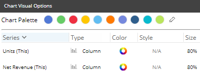
Visual options (colors, type, size, etc.) |
To access visual options in view mode, click In visual options, choose a color palette and configure each measure by selecting its type (column, marker, or line), size, etc.
|
|
In graph settings (in explore mode): |
|
|
- Truncate expanded rows |
If a dimension is auto-expanded, choose the maximum number of subgroupings to show for each expanded member. |
|
- Graph page size |
In graph settings, you can choose how many members to show. |
|
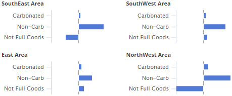
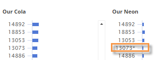
- Trellis |
If trellis is on, the graph repeats for each member of the top-level dimension (1st By) to break the data into smaller pieces. Each small graph groups the data by the next level (2nd By). To view a trellis, the widget must have at least two Bys and the 1st By must be expanded.
Tip: An asterisk (*) indicates that a member is not in the top results (i.e., page size) for a particular small graph, but it is in the top results for another small graph and is, therefore, included in the combined list of members. A measure trellis is also available. |
|
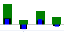
- Overlapping bar graph |
To turn on an overlapping bar graph, go to graph settings and clear the Enable Column Grouping box. Then, in Visual Options, adjust the bar size so that the top bar is the thinnest and the bottom bar is the widest. For example:
|
|
- Data labels |
In graph settings, check or clear the Enable Data Labels option. |
|
- Show Totals |
In graph settings, check the Show Graph Total option to include a bar representing the total of all members. |
 in the upper-right corner
to access these options.
in the upper-right corner
to access these options.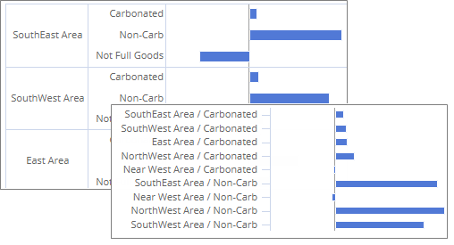
 in the
graph legend (visible on mouseover). Visual options are also available
under graph settings in explore mode.
in the
graph legend (visible on mouseover). Visual options are also available
under graph settings in explore mode.